Monday, September 3, 2018

Be Brave in your ART - Create Moments from your Heart

It's been a while since I've posted a Finnabair Ambassadors post. But here you'll see I'm still very much in love with Rust Pastes, especially since there are 4 new sets to play with!

This is a tag with several elements and layers that I shared along the way on FB and IG. I'll pull it together for you today and show you how it ended up in a frame,


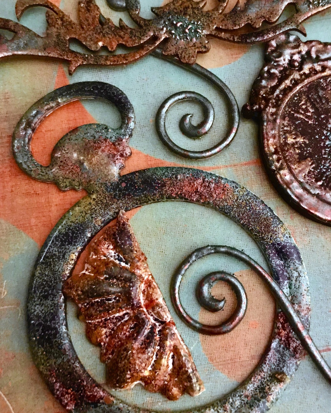
The tag itself has a simple arrangement of simple pieces that are enhanced with paint, inks, embossing powders and metal ephemera. The Quote Chip is from Tim Holtz.


  I started with a Honeycomb stencil and Plaster Paste and a #8 tag.  I spread the paste randomly, but on most of the tag.

Then I added a Heavy White Gesso over it all. The next layers are from the Camouflage and Metal Rust paste sets. I used only a couple colors.

Then I got my hands on the new Texture Fantasy Sets - Anemone & Coral, Northern Lights, Junkyard Treasures, and Old Walls. Now....... I'd drive you crazy with all the colors I used, and I'm not even sure myself, but I must say I am drawn here to the oranges, browns and blues. However a must is the Cream and Lavender.

The edges were colored with Rocky Road Baked Texture Embossing Powders from Seth Apter. I threw in some Ancient Amber and Patina Oxide here and there, too.


 Then I decide I need to lighten certain areas up. I added some white gesso and the lighter colors of the Fantasy colors. Gold Rush, Royal Red and Brass Hardware Metallique paints were dry-brushed onto top layers.


Here is a plain chipboard square that had layers of the pastes added with a palette knife. When dry, I added some metallique paints as highlights.

I used a scrap of corrugated cardboard as a background piece for the chipboard square. Distress and Archival inks were brushed on to add more color and a few spots of acrylic paints were splattered on. I painted the Tin Heart with some Brass Hardware and glued into place.


The tag is layered onto a piece of brass painted chipboard. I used Mechanicals - Wings, Mini Hardware, Tin Hearts, and Mini Knobs. The Chipboard Tiles are used to hold up the Wings and Zipper Pull. It's all put together with Heavy Body Gel.

You can see the subtle touches of the Lavender and Brass here.


The last thing are the little pieces at the top that are layered onto more distressed cardboard. I added more color with Brass Hardware and black paint to get a better contrast.  It was glued to a piece of painted chipboard as well,  and a jute cord was tied into a knot at the top.

It's all glued onto a hoarded piece of scrapbook paper from years ago that I really love and wish I'd bought several more sheets. That's life, right?


This little frame is a discount store find that I removed the glass from and added a few pieces of chipboard to build up. It's cheap and easy to work with.

I take the title from the words on the piece - ART, Be Brave, Moments and a Heart.


I hope you've enjoyed this walk-through of my project. Let me know if you have any  questions or comments.

Your Friend in ART,
Linda

Sunday, August 26, 2018

Blog Hop Album-Come Join the Fun

Hi everyone!!!

I'm so honored to be included in this great Blog Hop.  We're celebrating embossing powders from Seth Apter/Emerald Creek, Seth's Paint from PaperArtsy and Eileen Hull's Wrapped Journal die from Sizzix.  I hope you'll enjoy the hop and follow along with all the Artists sharing their amazing talents and projects created just for you.....here's mine.

I'll show you just how easy it is to enhance simple chipboard and paper. So here we go.

The cover is layers of paper that were stamped with archival inks and paints. Edges are created with Rocky Road EP, and the chipboard pieces are embossed with layers of Baked Textures.


This is the back and spine of the book. This die cut produces one long piece of chipboard that wraps around perfectly to create a brilliantly designed small journal.

Here I've used paints Midnight and Buff from Set 1 of Seth's collections before stamping with archival black ink. You will not find a better paint to stamp on - anywhere! I simply love to stamp on Fresco Paints.

BUT, the other wonderful feature of these paints is that some are opaque, some are translucent, and some are semi-opaque. That's the magic. You can stamp an image with archival ink, use translucent paint over it, and NOT lose the clarity of the stamping!!! Pretty cool.

Here I stamped small and large images on the paper. Then I painted highlights with translucents and watered down opaques and semi-opaques. Finally the piece of paper is completely covered with 2 layers of Chunky Beeswax before gluing to the back of the journal. I love how it turned out!


This signature is a great example of Seth's 4 Fresco Paint colors from PaperArtsy. I used mini clear stamps to stamp onto scrapbook paper. The middle image is a stamp with Deep Sea BT. The chunky powder really changes a detailed stamp by adding texture. The edges of the paper are enhanced with Rocky Road BT embossing powder.

All Seth's Baked Texture Powders from Emerald Creek are amazing.


Add a chipboard saying with pop dots and your signature cover is done. Another great PaperArtsy stamp is on the back of the other signature.


The number stamp is used with Patina Oxide powder and the splashes are with Rocky Road on this signature page.

The stencil work is created with texture paste and a mixture of paint colors. The pen nibs stamp have highlights painted with Fresco Paints.


 The True North is embossed with Chunky Beeswas and the Diary page stamp is embossed with Deep Sea. Diluted paints add color to the snail-looking images.


Now, here's adding color to metal. I painted this Grungy Butterfly from Finnabair with Buff, Midnight, Mahogany, Terra Cotta, and Smoked Paprika Fresco Paints.


Then I added the Baked Texture EPs in several layers of colors and clear Beeswax.

Is that cool, or what?!?!


This is the inside of my book before the signatures are added.  I painted the inside of the spines with Seth's new paints, and then stamped with archival ink.

Again you can see the color added to the stamped images. More to come with this section later.


Now I decided to add paint and EP to some plain wooden beads....you be the judge. 

They are strung onto the ends of the elastic cord that holds the signatures in place.


Here you see the dimension that comes with BTs on plain chipboard as you begin to add more layers to your project. The piece on the right also has micro beads embedded when the powders are still hot.


More examples of the embossing powders and stamps on plain chipboard. Simply push the chipboard face down into the embossing ink pad and add the embossing powders. When they're still hot, sprinkle more colors on top and let them melt in. Add a stamp to this "hot mess" and you get even more texture.


This is the last signature that has the key and plate added. I used the Deep Sea BT to emboss stamp the India Ink piece and a bit of distress inks for more color.


So there you have it. You put these 4 signatures together with elastic cord through the 4 holes that come punched with Eileen's fantastic die. I punched two holes in the journal to add vintage material as a ribbon tie. Copper eyelets fit into all these holes and just give it a bit of shine. Always love my metal.

To enter, leave a comment on each of the blogs for your best chance to win $150US prize package from Emerald Creek, Seth Apter, Paper Artsy and Eileen Hull Designs. Giveaway closes 8/29 and winner announced 8/30. Good Luck!


Now check out the rest of the "hoppers" here for more tips and designs.
Leave a comment for a chance to WIN!

Your Friend in ART,
Linda
Linda Cain (You are here)

Monday, August 13, 2018

Tiny Houses with the Ladies

Hi everyone!

It's been a while since I've blogged. For one thing, my really old HP died....just like that, after a power outage, it was gone. It left and never came back. (And yes, it was plugged into a surge protected, but it was it's time)

After a week or so, I put on my big girls panties and made my decision to buy a Mac....I know, you all knew that was the answer long ago, but I'm a late bloomer - a flower child.

So I'll share this with you as the summer gets back into it's hot session and it's time to go back to school. I'm learning to navigate the beast, and I hope I'm winning.

This is a collection of 3 Charming Houses from
Retro Cafe Art Gallery.
They have perfect inch square window frames. If you've followed me for years, you know I LOVE houses. It's what I started with years ago and I'll always be drawn to them.


I made them a few months ago, but never got around to posting since Kristin took a wonderful leave of absence to have the cutest little guy ever, Fletcher.

I painted the houses, windows and roofs with heavy white gesso. The Mechanicals-Vintage Snowflakes are treated to a couple of layers of Art Alchemy Waxes to give them more color.

This house has been decorated with the beautiful Graphic45 Tropical Travelogue 8x8 papers.


Each house has its own personality. This one has a vintage lace feel using the Ladies Diary papers and a beautiful black and white butterfly with coordinating Prima flower on top. I've added more micro beads with gloss gel to each flower and a touch of distress ink.


I love this butterfly with his pointed wings. This one has papers from different collections, but they all blend together really well.

As you may have noticed, being a rebel by nature, I turned the windows around at an angel. The old wooden barns used to have this type of window up in the eves years ago. It reminded me of them.


The houses have a hole in the top that can be used to add a string or cord in order to make it a hanging decoration. I haven't decided what I'm going to do with them yet. They could also be used as a center for a collage.

Most products are available at the Retro Cafe Art Gallery shop by clicking the links below. How easy would these be to make for Christmas gifts, eh?!?!

Check them out and let me know what you think. Give it a go.

Your Friend in ART,

Linda

Products Used:
Charming Inchie Window House Ornament - Style 1
Charming Inchie Window House Ornament - Style 2
Charming Inchie Window House Ornament - Style 3
Antique Rose Ladies Collage Sheet
Belle Roses Collage Sheet
Art Doll Head Collage Sheet
24 Butterfly Paper Cuts
Heavy White Gesso and Soft Gloss Gel
Prima Flowers
Lucky Emerald and Old Gold Art Alchemy Wax
Gold and Silver Micro Beads
Graphic45-Tropical Travelogue Papers
Graphic45-Ladies Diary Paper
UHU Glue Stick

Wednesday, June 27, 2018

A Texture-Layered Tag

This is a collaboration of many of my favorite products.

And I love how it turned out.

It starts with a plain manila tag, some Plaster Texture paste and a stencil. The Rust Pastes and Metallique paints are added for color and contrast. It's then glued to a larger piece of white chipboard.

The Baked Texture embossing powders from Seth Apter are the next step. You're gonna love how these babies add texture and dimension to your projects.


This is the center section of the tag showing the first layer of Plaster Paste and several layers of Rust Pastes and paints from Finnabair.


These are the paper clay wings made in a Prima silicone mold.


I used two colors to create these wings.


Now this was really fun! I added embossing ink to chipboard and paper clay pieces, then I sprinkled the gorgeous Baked Texture embossing powders
on them and heated.

VERY cool results with different heating times can be achieved.


The metal elements are Mechanicals from Finnabair and the vintage picture is
from Retro Cafe Art Gallery.

I had several clay pieces I made up from Iron Orchid Designs with different
paint combinations, and this beautiful red piece was perfect for the tag.


I hope you enjoyed this collection of products and will try out the different
ideas I touched on here.

Your Friend in ART,

Linda

Wednesday, June 20, 2018

Rediscovering Vintage Journals

Just a note to tell you how thrilled I was to have 2 of my new-found and uncompleted Art Journals published in the July/Aug issue of
Somerset Studio.

Years ago I made several journals of different sizes and shapes. Some I sold, and others were given as gifts. 

This one is a Barnes and Noble kraft-colored journal refill. It was only partly
decorated before I put it in a box with the other journal and placed them on a 
shelf.....years later I found them and decided to finish them.

Old and new elements are used to embellish the covers and backs. The Vintaj 
Brass pieces on the cover here and the Finnabair stars are always my favorite additions. The hand-dyed ribbon with luscious layers of colors from rich purple to brilliant orange is tied over the gold and black metallic trim. 


This small Zutter-made book also uses the linen-like papers with stamped images and a couple of Vinaj brass pieces. 

I've used white and black pen dots for a decade and added more to this one when I found the basic start. 

The trim and brass key was used to divide the two papers, and the black gems creates a little more contrast.


Sadly I didn't photograph this little book before I sent it off, so this is a picture
of the spread in the magazine.

All the products and instructions are in the magazine with many more pictures.

I hope you enjoy all the wonderful Artist's creations that were so brilliantly
displayed in this great publication. On newstands for you July 1st.

Your Friend in ART,

Linda

Friday, June 1, 2018

Turning a Project Around

Hi everyone!

This post is all about taking a project that you've put lots of time and effort into, only to see it ruined by a blotch of paint, a blob of glue, or other "can't fix this" misstep along the way. 

This started out on a 4x8" stretched canvas with lots of scrap papers, tissue paper, and stenciling for a background. It also was running the opposite direction with a stunning vintage lady on the right side where the metal turn is now. 

I had applied soft matte gel and then decided to spray some blue around her base. Well, long story short, it ruined the image of the lady and would not budge. That having been said, I ripped her off!!!

And the canvas then sat on my desk for weeks......usually I don't give up that easily, there's always a way to cover a mistake up, but in this instance, I pushed it aside. Rather gave up on it for a bit.


But then weeks later I decided to "turn this piece around."  Literally.  I added more tissue paper, some script and number stamps, a new vintage image, and we were off to the races!!!

I dug into my metal ephemera stash from picking my brother-in-laws garage years ago. I used this antique brass plate, and added a turn with a tiny number. Both pieces have Metallique Waxes on the high points to make them shine.

(If anyone knows the significance of the numbers on the plates that were nailed to a cabinet with many drawers, please let me know. We found no rhyme or reason to them.)


I wanted bright colors to offset the sepia-toned photo, so the butterflies took center stage. The Art Stones with various Metallique and Impasto paints got surrounded with a mixture of Micro Beads and Glass Glitter.

Shading brought the piece some dimension, and white splatters broke up the background just a bit.


I guess the lesson here is ~ never give up. Much like all events in life, there's usually a better day coming. Things will look different tomorrow. Hopefully you can take something that didn't quite work, and "turn it around" to create a whole new situation that makes you happy.

That's what I did here. That's what I hope you can do in your situations when life gives you lemons ~ you can make lemonade.

Be well and be good to each other.

Your Friend in ART,
Linda


Other Products Used: Butterfly Paper Cuts, Tim Holtz Vintage Paper Dolls, PaperArtsy Mini Stamps, Black Archival Ink, Tissue Papers, Washi Tape, Tom Bow Markers.

Friday, May 25, 2018

Relieving Stress by Creating ART

 Stress.....we all have it. Sometimes it's our job, or our kids, the weather, bills, our health...but at the end of the day, we ALL have stress.

How we deal with it is another thing. Lots of people use their creative abilities as a way through it all. Some play music, or draw, paint or decorate a space. Most of us just want to curl up in a ball and hide, or sleep, but working with what generally makes you happy is a much better solution. 


This project took a long time for me to finish. It started with an unfinished wooden box from Hobby Lobby and paper clay elements that I painted with black gesso.

I really loved how the clay dried with cracks and the texture of the pine box was slightly rough. It adds character and age to the unit.


I proceeded to add Opal Magics and Metallique Paints on the paper clay mould embellishments and the rest of the box.

This is a look at the first layer of paint. A dry-brush method is best on the black gesso when using these paints.

And then it sat there....for weeks, perhaps months. I knew it needed something, but I just didn't know what.  


There are lots and lots of layers and colors of paint here. Way too numerous to list. I'd be lying if I thought I could actually remember them anyway, but just know, the Opal Magics went on first so they really popped on the black gesso, and the brighter, more intense Metalliques were added last.

 A bit of German Dresden trim was lightly painted and used around the top. 


More layers of color were brushed on. It seemed like a never-ending battle to get the right colors to take the spotlight.

A few Mini Stars were thrown in to cover the ends of the Dresden on the front and back.


I added Magical Pond Sparks paint in the centers of the Lotus Flowers with 2 different sizes of Art Stones.

The Heart Key has oranges and reds, like the Lotus, in several layers of color and intensity.


It's all put together with 3D Matte Gel, Soft Gel and Heavy Body Gel.

I've been in the garden a lot since Springtime is here and Summer is fast approaching. You have to strike while the iron is hot to get those seeds planted and annuals in the ground. Now that that is done, I can spend more time in the Studio.

Today I'm also on the Finnabair blog with this Spotlight project and more insight into creating to relieve stress. So click on the link and check it out.


Hope you're inspired to create and share your inspirations and fears.

Your Friend in ART,

Linda

Wednesday, May 2, 2018

It’s Been A While.....

It really has been a month since I posted. But I got an iPad for Mother’s Day from my kids, and decided to see if I could post from it.

Not such an easy task....oh well. Here goes nothing.

These are tags that I made using the new Baked Texture embossing powders from Emerald Creek and Seth Apter.


I started by gluing down a patchwork of papers onto a tag, then adding layers of embossing powders until you like the results.


I added a few stamped images from PaperArtsy to fill in the blank areas. The brass pieces are from Retro Cafe Art Gallery.


This shows the embossing powders on a black tag that had Distress Oxide inks as a base.

 Love the globs of gold.


Hope you enjoy and are inspired to play.

Check back later for a couple more projects that I've made but hadn't gotten 
around to posting here.

Your Friend in ART,

Linda

Friday, March 9, 2018

My Altered Butterfly Wine Bottle

Well, I wasn't going to bother with a blog post, but the pictures turned out so much better than I'd even expected. The black backdrop really made a big difference. So now I'll have a record for prosperity. 

This is a plain green wine bottle. We learned to create a great crackle finish in 
Christine Ramirez-Campbell's class last Saturday at the Prairie Stamper's Retreat. What a great technique and terrific lady.

Having said that, you'll have to take one of her classes to learn it!!!


I did add some glazes over the crackle to create an aged look.

I knew what I wanted to create, so I made some embellishments with Iron Orchid Designs moulds and paper clay, and let them dry before I went. 

The beaded topper was amazingly easy to create, and Christine had the BEST beads to pick from. 

I had already made the chain/charm piece years ago and had no place to put it, so this really worked out great. It's using Vintaj jewelry pieces and a vintage photo. 


The Grungy Butterfly is from Finnabair as well as the Vintage Snowflake with a rhinestone center. I used a mixture of glass glitter and micro beads around the outside.

All the paints are Metalliques from Finnabair as well as the micro beads and glitter, and it's glued in place with 3D Matte Gel....great stuff, and Soft Gloss Gel for the tiny stuff.


I tried several different colors before I finally found the combination that I liked. The red was too red; the silver didn't stand out enough; the gold alone was too washed out; added some turquoise;  then some amber - soooooo just keep playing until you get what you like.


I used two pieces of rhinestone/pearls trim at the top, and some fabric trim along the bottom. Add some paint to the fabric to create some contrast.

Last thing, hit the high points with Metallic Waxes. You'll love them.

Now I'm on the prowl for some of the cool beads and the wire to make the stoppers. This is my new obsession.....

So empty out that wine bottle and put it to good use for decoration!

Your Friend in ART,

Linda